I admit that I don't have experience with drawing fonts, thus I may be way off in my judgement, but... I would be reluctant to use post-rasterization information. Especially since the initial rendering of the outline here is done by simply drawing each contour separately, without processing of sub-pixel intersections. Neither does it leave enough additional information that could be used to recover the shape test later. Rasterization erases information and considering that the countours could act like
space filling curve at small point sizes, and that they could interact (possibly multiple times) in such densely filled regions, I think decoupling the contour drawing from the shape filling will be error prone.
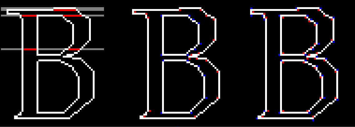
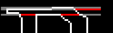
After vaguely familiarizing myself with TT, I conclude that the drawing is very generally posed as is, with no assumptions that could offer shortcut to the drawing engine. For example, the specification does not appear to rule out contour intersections. They even have shown such (quite arbitrary) intersections in a graphic
here (the one with the discs). I have not found requirement prohibiting self intersection either. Not that I expect any real fonts to use such, but you couldn't rule it out, formally speaking. Additionally, as Sik wrote, the fill test is done on "not zero" rather than "positive", meaning that clockwise and counter-clockwise annihilate each other on intersections, but both constitute a fill region on their own (that is - in their exclusive part). To top this off, the contours use
bezier curves (understandably), which you may not be processing just yet. Or you have found fonts that use none. It would however explain why some of the letters on the pictures look rather rugged. This also poses a design choice - how do you process the curves will determine the complexity of the geometry problems later. You could do so by approximating the bezier equations with piecewise linear ones or use them directly as such when performing intersections and sorting points.
All of this means several things. There will be a lot of geometry processing. I cannot offer specifics at the moment, but at the very minimum it will involve solving for segment intersections - lines and possibly bezier curves. A
line sweep algorithm for segment intersections seems promising, because it would synergize well with scanline raseterization. Because most shapes lack any intersections at all, and have simple inside and outside contours, the algorithm should preferably handle trivial cases efficiently. From what I remember, line sweep algorithms usually involve sorting the edge endpoints vertically, from maxima to minima (which for bezier curves are not actually only the endpoints). This simplifies the search for intersections significantly when the plane is swept by the scanline, the said points are encountered in sorted order and each segment is only tested the first time it is "encountered" by the plane sweep, only against neighboring segments. (Edit: And later after the intersection points are reached, the intersecting segments are rearranged and retested, but it's still a faster approach.) Of course, there might be better novel techniques. In this regard, the wikipedia article I linked to is where I would start searching. (I will take this further on my own, of course, but my exploratory approach may take some time. By the way, there's a rather nice
python library for font data parsing, for whoever is interested in python prototyping. It comes with a tool for making an xml dump from any supported font file.)
Lastly, you have a choice on how to cache the glyphs. Whether to cache the rasterized result or the geometry output. The former (edit:meant latter) would only make sense if you support sub-pixel "pen positions" and I am not sure whether and how this is supported - i.e. whether you round up the advance width or the grid-fitting code (if present) can round it up, or you are supposed to add it as is and reexecute the code every time you encounter the character at a different pen sub-pixel offset. In any event, text at small point sizes would encounter the same character many times, i.e. will have decent cache utilization, while text at large point sizes will have more favorable ratio of the rasterization to geometry work (cached or not). So, I suspect (but things have to be benchmarked) that the cost of handling edge intersections may be masked out in practice.
Some links that I used:
TrueType Reference ManualTrueType fundamentalsFreeType Glyph Conventions (not a TT spec obviously, but has some general information)
An introduction to glyphs, as used and defined in the FreeType engine (interestingly, super-titled Glyph Hell)
Glyph Conventions (duplicates a section from the FreeType manual, but better page layout)